DATE:
AUTHOR:

DATE:
AUTHOR:
What is Brand Color Psychology?
Brand color psychology is the study of how color impacts the way we perceive brands. Colors have a powerful effect on our emotions. And these emotions play a major role in how we behave as consumers. Brand color psychology provides a framework for understanding how and why we interact with the brands in our lives.
While the effect that colors have on our emotions differs from person to person based on gender, cultural context, personal experience, and neurological variances, there are some general guidelines that have been borne out by countless color psychology studies. An understanding of these guidelines gives you one more tool in the underlying goal of branding: architecting reality by influencing and shaping consumer perception.
You’re probably aware that the color red can evoke feelings of either romance or danger. Or that blue can call to mind emotions like serenity or coldness. But what about orange? Or grey? And what of the more subtle emotions like harmony or hope? Which colors are most associated with those?
Since color is among the fundamental visual stimuli in the human sequence of cognition, these questions are important. Color psychology has the answers.
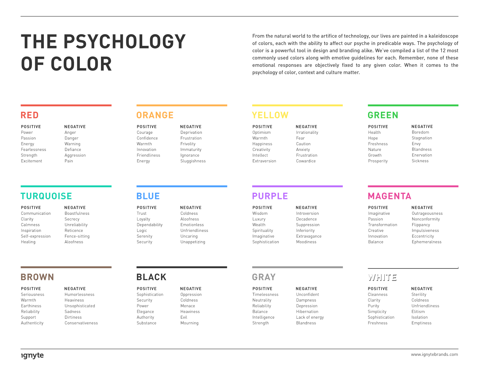
We’ve created a list of the 12 most commonly used colors in branding and logo design, along with the emotive guidelines for each. Remember, none of these emotional responses are objectively fixed to any given color.
When it comes to the psychology of color, context and culture matter. And because one color can represent two wildly divergent feelings, the specific way in which a brand utilizes color can literally mean the difference between sickness and health (green). With that in mind, and a solid understanding of your brand personality, choosing the right color for your brand can be a rational, informed decision, rather than a fleeting or whimsical preference.

The Psychology of the Color Red
Arguably the most stirring of colors, red’s effects on the psyche are not subtle. It’s therefore important that it be used carefully for branding purposes. Red has been shown to reduce analytical thinking—it speeds up and intensifies our reactions. There’s a reason why clearance sale prices are put on red tags.
Athletes up against opponents wearing red are more likely to lose, and students tend to perform worse on tests if exposed to red beforehand. Red, after all, is the color of stop signs, grammatical mistakes, and negative finances.
Red has the longest wavelength of all the colors, and so appears to be nearer than it actually is. It is the color of passion and romance. Red tends to increase the appetite and is used in a range of colorful terms centered on excitement: red-hot, red-handed, paint the town red, seeing red. Inside the U.S. red is associated with conservatism. Outside the country, it’s long been the banner color for communism and socialism.
Other emotional traits linked to red include the following.
Positive implications: Power, Passion, Energy, Fearlessness, Strength, Excitement
Negative implications: Anger, Danger, Warning, Defiance, Aggression, Pain
The Psychology of the Color Orange
At the crossroads of red and yellow sits orange. Orange is stimulatory, conjuring feelings of excitement, enthusiasm, and warmth. It is a fun, energetic hue found in the branding of many sports teams.
Not unlike red or yellow, orange is used to draw attention—in traffic cones and advertising collateral. Consumers tend to associate the color orange with value, in fact, a reality that brands like Home Depot have capitalized on.
On the physical end of the spectrum, orange evokes comfort like food, warmth, and shelter. It is the color of sunset, citrus, and pumpkins, forever linked to falling and Halloween for American customers. This is especially the case when it is paired with black, which lends it a tone of cartoonish dread and frivolity.
Emotions central to the color orange comprise the following.
Positive implications:
Courage
Confidence
Warmth
Innovation
Friendliness
Energy
Negative implications:
Deprivation
Frustration
Frivolity
Immaturity
Ignorance
Sluggishness

The Psychology of the Color Yellow
Yellow seems to have the smallest fan club of all the colors, but those who do like it are passionate about their preference. It is widely considered a cheerful hue, but too much yellow can also trigger feelings of anger, frustration, fear, and anxiety. This is because it’s the most difficult color to take in. It’s enough to make babies cry in some studies.
Yellow has been shown to increase metabolism, and can lift self-esteem when utilized correctly. Because it has a relatively long wavelength, it is the most visible color; it’s stimulating and attention-grabbing. Traffic signs, advertisements, legal pads, and certain warning labels take advantage of this fact.
Other feelings evoked by yellow include:
Positive implications:
Optimism
Warmth
Happiness
Creativity
Intellect
Extraversion
Negative implications:
Irrationality
Fear
Caution
Anxiety
Frustration
Cowardice
The Psychology of the Color Green
The color green is the easiest on our eyes because it requires no adjustment when it hits the retina. It is therefore calming, restful, and pleasing. Performers waiting to go on stage or television wait in “green rooms” to relax. Green can actually improve vision, and is used in night vision because our eyes can discern the most shades of it.
Sitting comfortably in the middle of the spectrum, green is the color of balance. It represents nature, fertility, and even sexuality. The myth of the green M&M is an enduring one. A green world is a safe world, one that is lush, full of water, and life-giving. For this reason it’s a reassuring color. Like all colors, though, green has its negative side. It is at once the symbol of health and sickness, luck and jealousy.
The list of green’s emotive attributes includes:
Positive implications:
Health
Hope
Freshness
Nature
Growth
Prosperity
Negative implications:
Boredom
Stagnation
Envy
Blandness
Enervation
Sickness


The Psychology of the Color Turquoise
Turquoise is a transformational color, embodying its spectral position between the contemplative security of blue and the organic ease of green. It suggests clarity of thought and communication. It is an inspiring color, associated with recharging the spirit, replenishing energy levels, and provoking positive thought.
Turquoise is at once introspective and outwardly expressive, suggesting creativity and self-expression. In the marketplace, turquoise is often found in brands centered on communication, including education, media, and computer technology. It is an ideal color for cleaning products as it evokes cleanliness and purity without being too sterile.
As a color of transformation, turquoise can suggest indecision and a lack of grounded deliberation when used in the wrong context.
Other psychological traits associated with turquoise are:
Positive implications:
Communication
Clarity
Calmness
Inspiration
Self-expression
Healing
Negative implications:
Boastfulness
Secrecy
Unreliability
Reticence
Fence-sitting
Aloofness
The Psychology of the Color Blue
Where red is the color of the body, blue evokes the mind. Serene and calming, it is the color of clarity and communication. According to color psychology studies, blue has been shown to be the most common favorite color among the world’s population and is particularly preferred by men. It is, of course, everywhere in our daily lives. It’s the color of the sky, the oceans, and the lakes.
This global preference and environmental omnipresence make blue non-threatening, conservative, and traditional. Brands are not taking any risks when they call on a shade of blue for their identity. It is seen as a sign of stability and reliability, and it’s been shown that workers are more productive in blue rooms.
Blue, of course, is also the color of sadness and coldness. It is among the least appetizing of colors as it is an indicator of spoilage and poison. Weight loss plans suggest you eat food off a blue plate as you’re liable to eat less of it.
Across the spectrum, blue’s emotional attributions include:
Positive implications:
Trust
Loyalty
Dependability
Logic
Serenity
Security
Negative implications:
Coldness
Aloofness
Emotionless
Unfriendliness
Uncaring
Unappetizing

The Psychology of the Color Purple
At the intersection of red and blue, purple is an intriguing balance of masculine and feminine traits—at once warm and cool, yet neither. This melding of blue’s calmness and red’s stimulation can be unnerving unless the dominance of one or the other is clear. Blueish purple, then, is patently cool, while redish purple is patently warm.
Purple is the color of royalty and bravery, and connotes wealth, luxury, and sophistication. It is among the rarest colors in nature and as such can come across as either special or artificial.
Purple sits in the shortest wavelength and is the last to be visible. For this reason, it is associated with time, space, and the cosmos. It’s imbued with spirituality, contemplation, and mediation, suggesting creativity and imagination.
Purple’s attendant values include the following.
Positive implications:
Wisdom
Luxury
Wealth
Spirituality
Imaginative
Sophistication
Negative implications:
Introversion
Decadence
Suppression
Inferiority
Extravagance
Moodiness
The Psychology of the Color Magenta
Not quite red and not quite purple, Magneta is very much its own hue with a slew of distinct and psychological implications. Magenta is a color of emotional balance and physical harmony. It’s sophisticated yet pragmatic, evocative of logic and perspicacity.
Magenta is redolent of compassion, support, and kindness, and is associated with feelings of self-respect and contentment. It’s a color of transformation, suggesting the sloughing off of old ideas and the embrace of new ones.
Magenta retains a certain level of boldness from red and can thusly appear either outrageous and shocking or innovative and imaginative, depending on the context. It is well suited to creative, nonconformist endeavors.
The psychological implications of magenta include the following:
Positive implications:
Imaginative
Passion
Transformation
Creative
Innovation
Balance
Negative implications:
Outrageousness
Nonconformity
Flippancy
Impulsiveness
Eccentricity
Ephemeralness


The Psychology of the Color Brown
Brown is made up of constituent hues red and yellow, with a large percentage of black. For this reason, it is imbued with much of the same seriousness as black, but with a warmer, softer tone.
Brown is sturdy and reliable, the color of earth and abundant in nature. It has the dependability and authenticity of wood or leather and is more often among the preferred colors of men than women. It has quietly supportive overtones, but can also be sad and wistful. At heart a practical and utilitarian color, brown can be sophisticated if used correctly.
Brown’s psychological attributes include:
Positive implications:
Seriousness
Warmth
Earthiness
Reliability
Support
Authenticity
Negative implications:
Humorlessness
Heaviness
Lack of sophistication
Sadness
Dirtiness
Conservativeness
The Psychology of the Color Black
Black is the total absorption of all color. This fact alone has profound psychological implications. Black is a symbol of power. It is a barrier color: it absorbs energy and enshrouds the personality. It is essentially the absence of light, which gives it its ominous overtones.
There is no nuance to black, at least not conceptually. With its diametric partner in crime, white, black stands for sophistication, weight, and seriousness. Black is timeless and effortlessly stylish. Think the little black dress or a certain iconic black turtleneck.
Black is the color of sophistication, but also of mourning. Worn by both priests and villains, it can imply submission (to god) or nefariousness and evil.
The complete psychological attributes of black comprise the following.
Positive implications:
Sophistication
Security
Power
Elegance
Authority
Substance
Negative implications:
Oppression
Coldness
Menace
Heaviness
Evil
Mourning

The Psychology of the Color Gray
Pure gray is the one color that’s been shown to have no dominant psychological characteristic. But that doesn’t mean it’s not powerfully suggestive. Gray is modern and sophisticated, a hue that has worked well for technology and luxury brands. Its inherent subtlety can be both a strength and a weakness.
Skillful use of gray evokes power and sophistication; it is a crisp slate on which bold concepts thrive. Gray is the color of ominous but powerful weather—a cloak over the existence of color rather than the absence of it. It has a profound effect on the colors around it, working both to balance tones and establish negative space in lieu of white.
The attributes of gray comprise:
Positive implications:
Timelessness
Neutrality
Reliability
Balance
Intelligence
Strength
Negative implications:
Lack of confidence
Dampness
Depression
Hibernation
Lack of energy
Blandnes
The Psychology of the Color White
Where black is the absorption of all light and the embodiment of all color, white is the reflection and absence. For this reason, it has long been a symbol of purity and innocence. In healthcare settings, white implies cleanliness and sterility. Outside of the hospital, it is an irrevocable indicator of the fairer seasons—rare is the fashion faux pas more egregious than wearing white after Labor Day.
White’s association with marriage and wedding dresses is deeply entrenched. It is also modern, leveraged by brands like Apple to denote a chic, sleek style. It is the most minimal of all the colors, imbuing a heightened perception of space.
White is the color of blank slates, symbolizing freshness and new, untarnished beginnings. The sterility that is positive for white in the healthcare sphere can count against it elsewhere. Used haphazardly, white can bring to mind coldness, emptiness, and isolation.
The psychological implications of white include:
Positive implications:
Cleanness
Clarity
Purity
Simplicity
Sophistication
Freshness
Negative implications:
Sterility
Coldness
Unfriendliness
Elitism
Isolation
Emptiness
Conclusion
Your brand identity defines how the world perceives your brand. Color is an integral component to that perception. Choosing the hue that best embodies your brand personality is critical to building a truly authentic brand. It isn’t a decision that should be left to whim. By understanding the psychology of color, you can make a selection based on insight gleaned from innumerable scientific surveys. So, which color is right for your brand?
